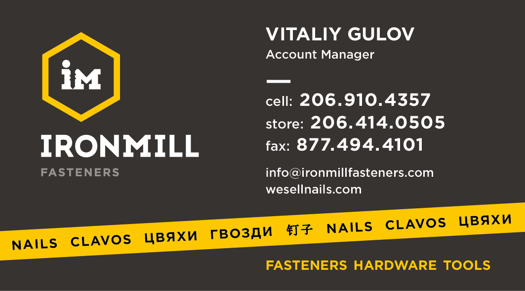
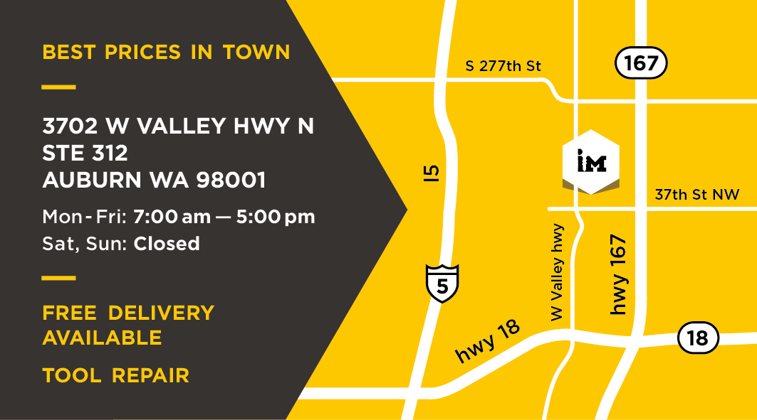
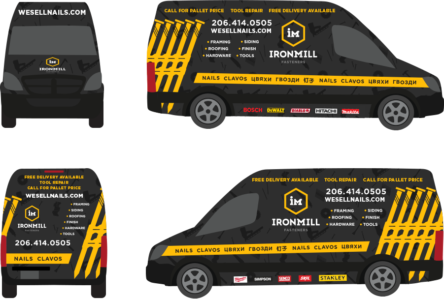
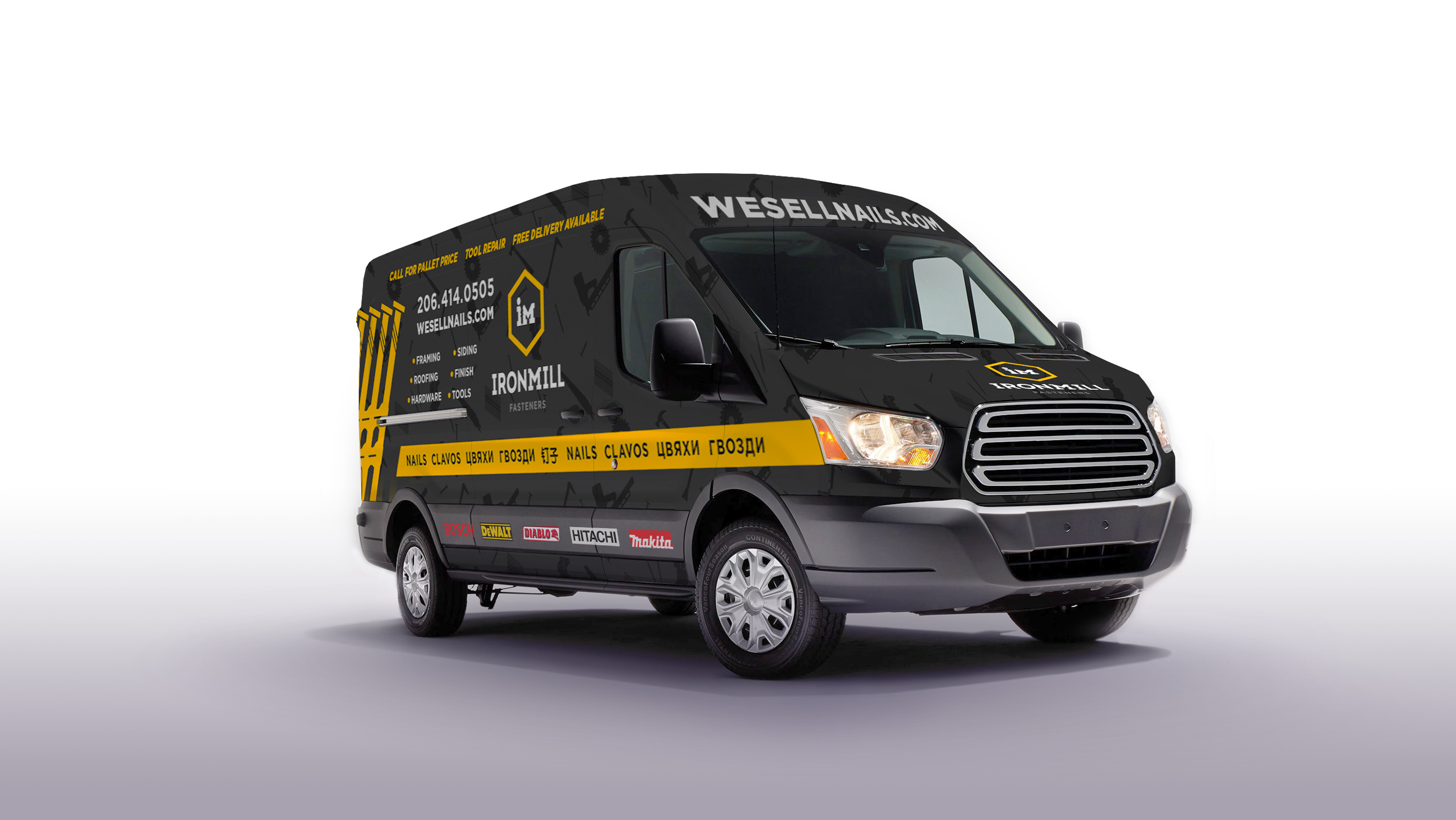
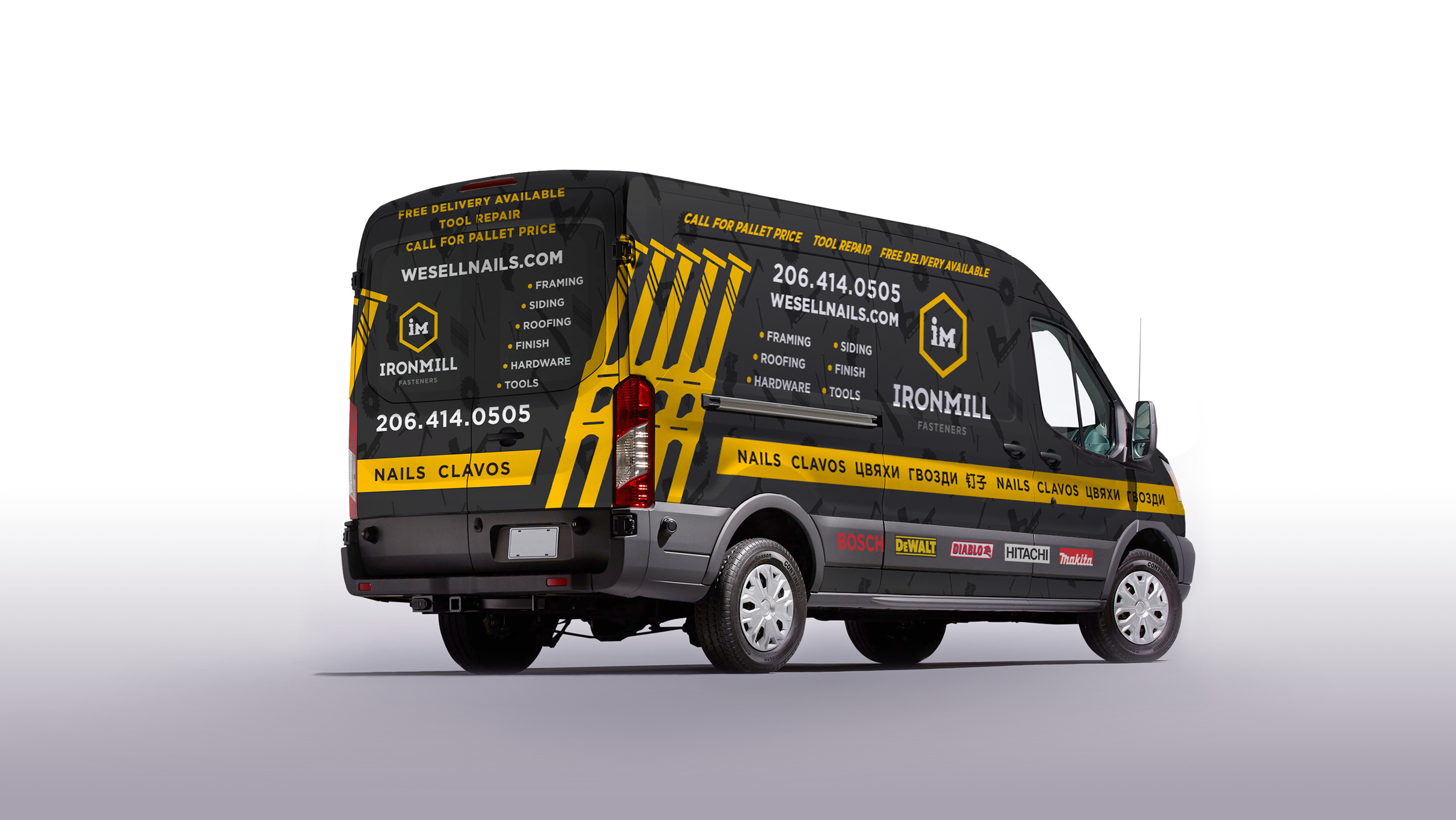
 Ironmill is a company in Auburn, Washington, which produces and sells fasteners; their market segment is private housing construction.

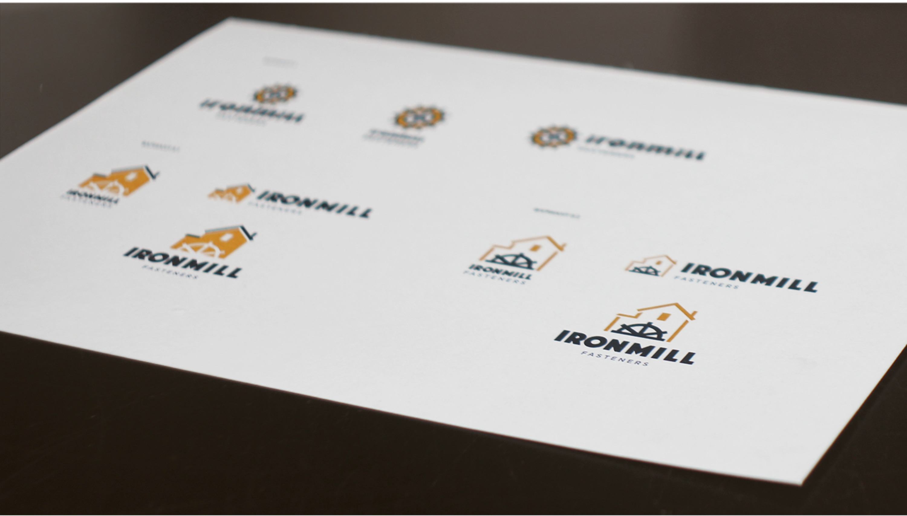
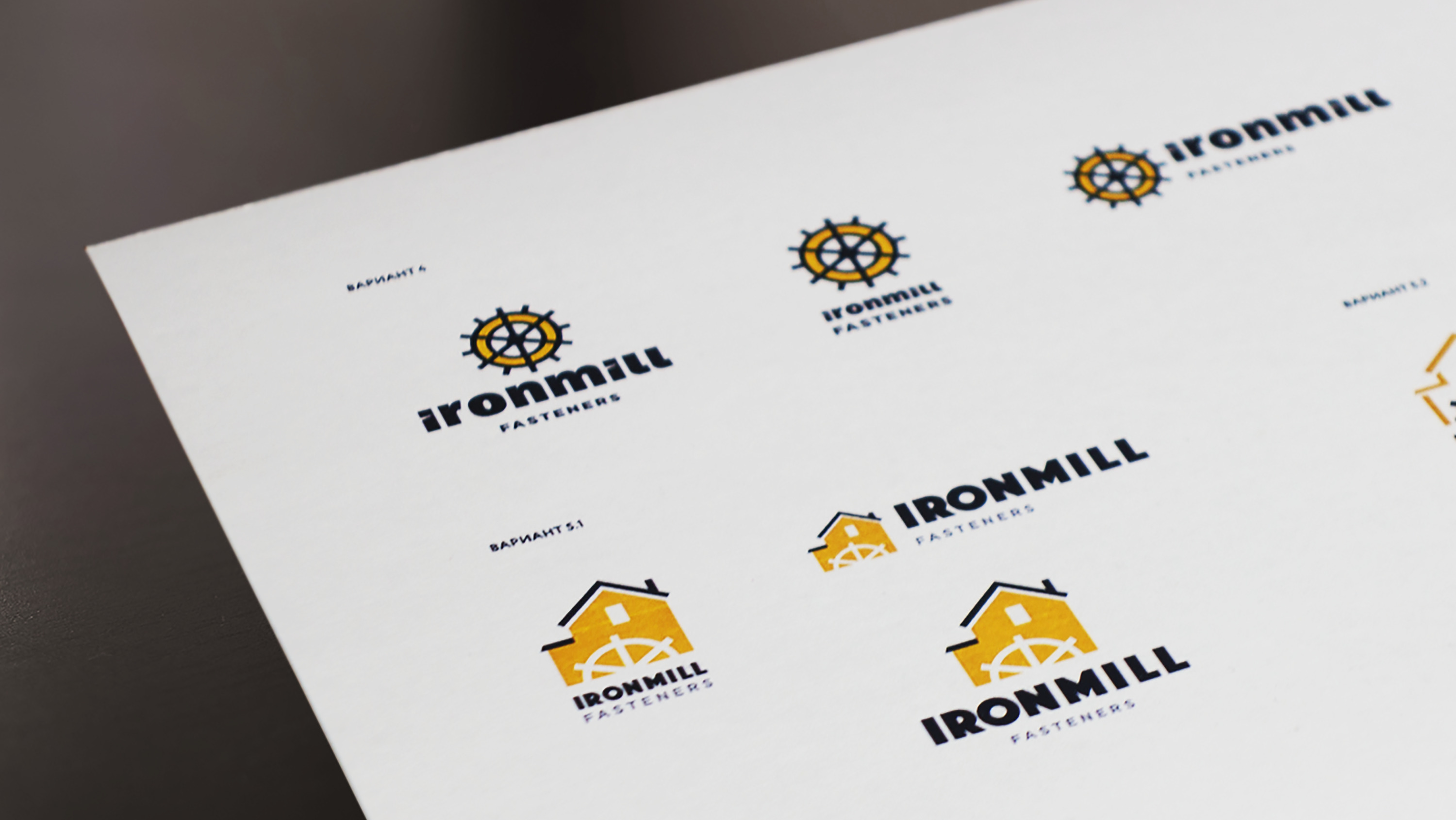
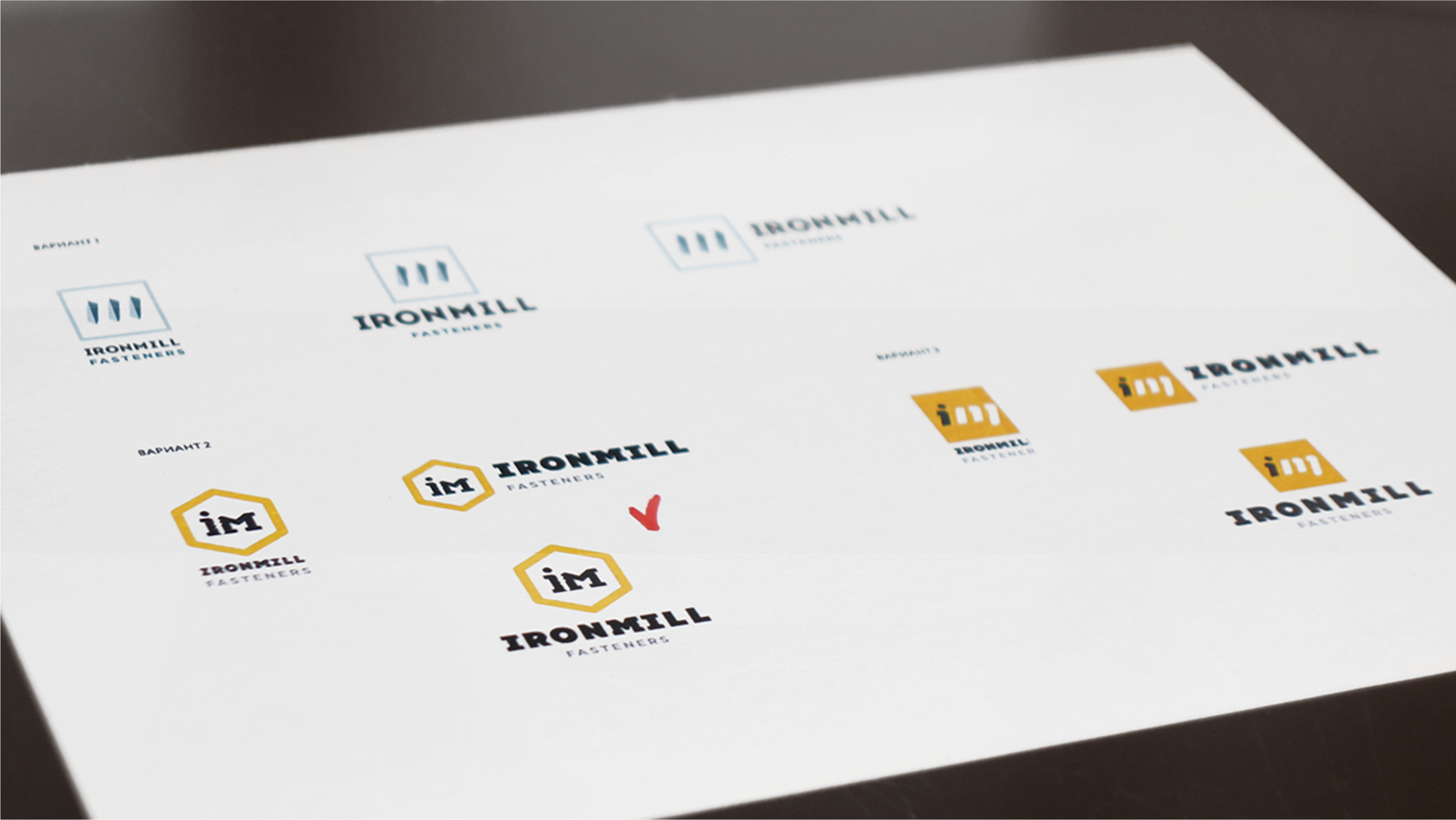
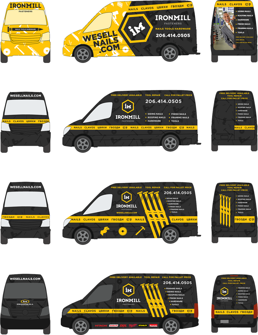
It was important for the client that as graphic designers and marketers, we consider different options that we would enter the market with and evaluate what advantages and disadvantages each of them has.
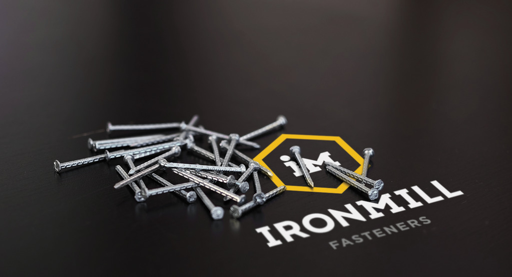
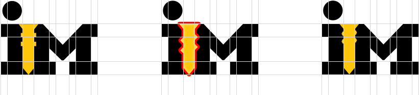
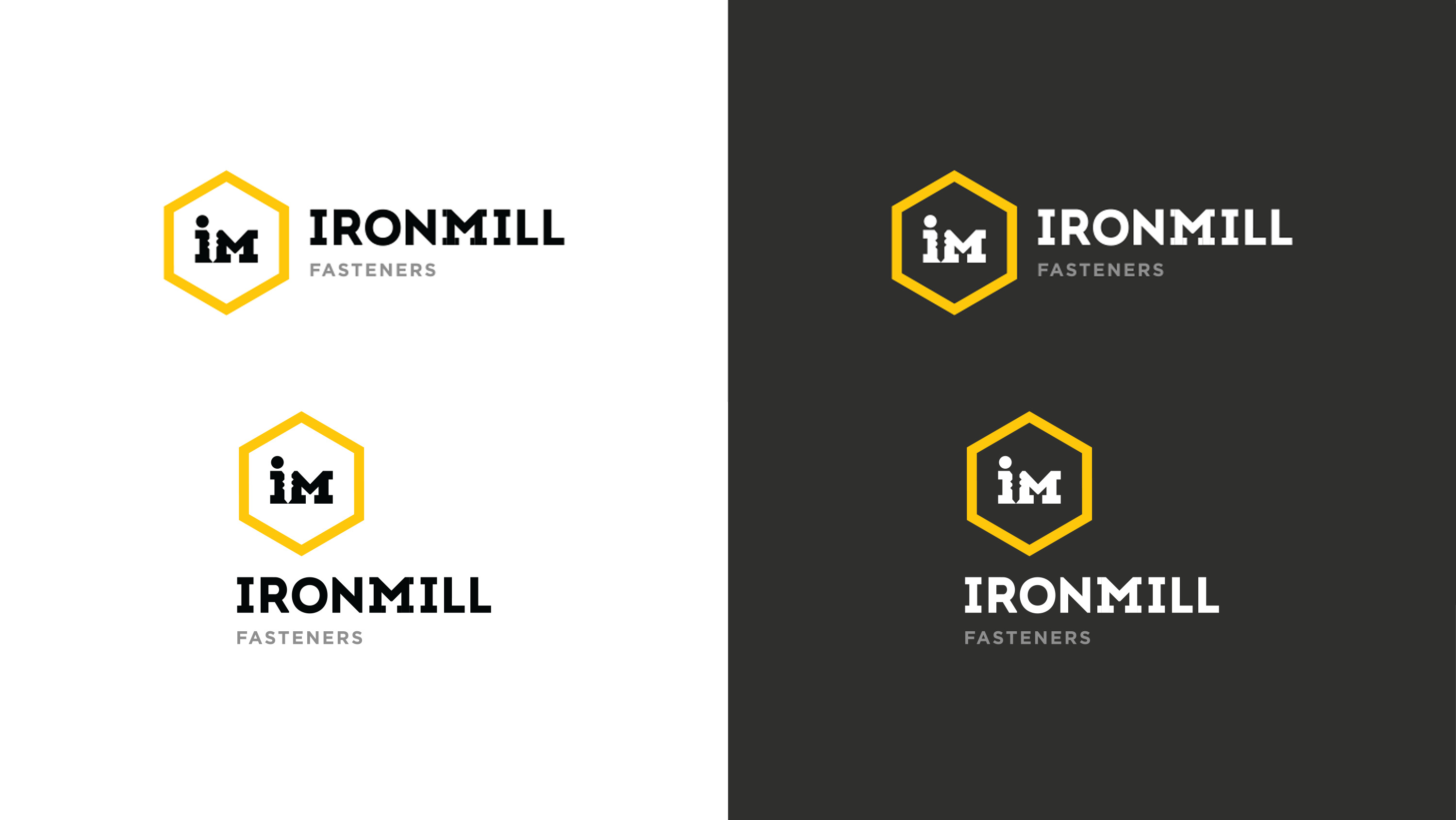
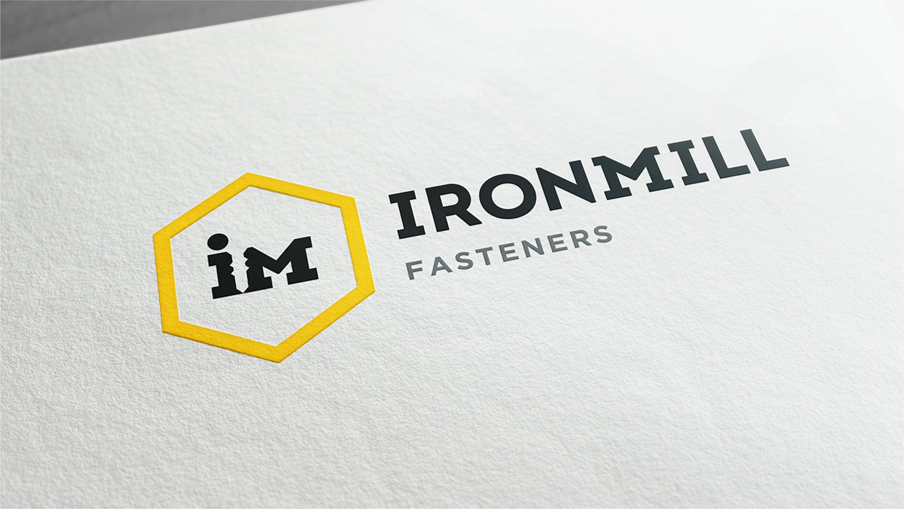
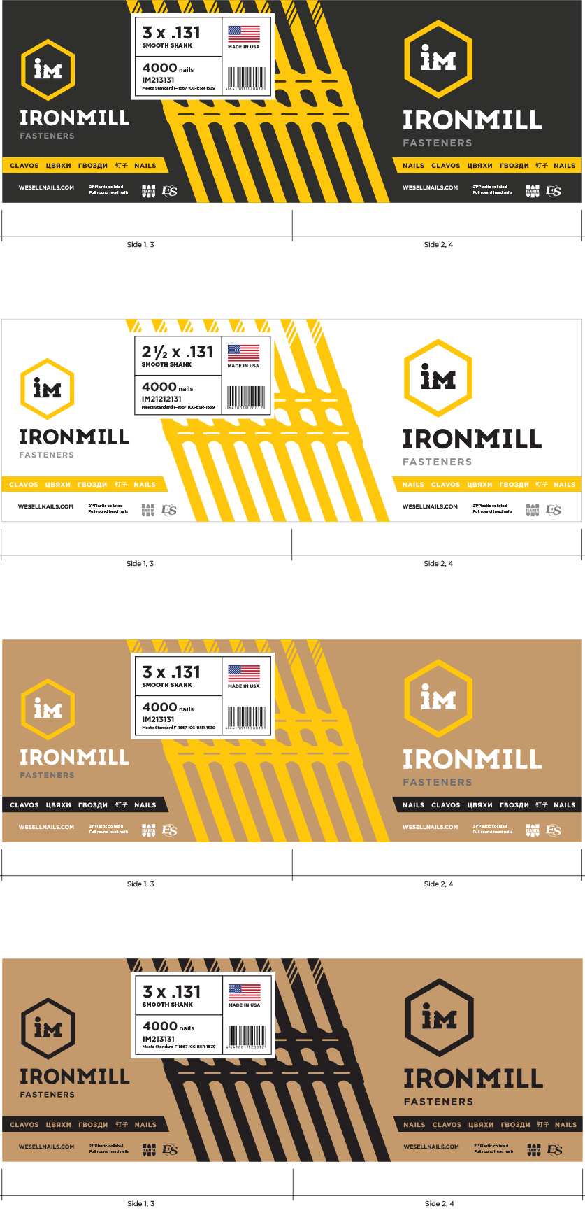
We discussed the logo versions with sample groups of the target audience, the company’s first clients, and the Ironmill Fasteners management. In the end, the third version was chosen. It took us some more time to find the right shape of the model fastener and finalize it.


Customer review
I’ve already recommended Manufactura to my business partners. They think there might be communication problems caused by the great distance between Russia and the US. What they don’t know is the management standards in this company. We had a personal account manager working with us; we called him whenever it was convenient for us and he did most of the work related to communications and feedback collection. An excellent link between us and the designers.
We’ve been in business for 8 years now and over the years we have used the services of dozens of design studios and freelancers. Working with Manufactura was a unique experience. Previously, we came up with ideas and the designers just translated them into visual images. That is, they simply transferred what we described to them. As for Manufactura, they come up with ideas, justify and explain them. This is a totally different level. We do not have to do a designer’s job.
The work resulted in a premium level design reflecting the standard of our service. Americans attach great importance to design. They are used to high quality. Now we are getting very positive feedback. We are not ashamed to come to any customer, no matter if their budget is $ 100,000 or $ 2,000,000. Our business is growing and the design played its role in it. At the moment we’re facing a new challenge with another project. Who do you think we’ve turned to?
Stas Repin,
CEO at Ironmill Fasteners
Project team
Dmitriy Provotorov
Product Manager
Elena Moiseeva
Lead Designer
Nadezhda Steshenko
Designer
Petr Tulinov
Designer
Dmitriy Sidorov
Art Director
Sergey Kotsyuba
Manager